The job visualization page presents a scatter plot view with images clustered based on their features and embedded into two dimensions. When a visualization job is submitted, the images are internally organized into a hierarchy of clusters. This organization allows quick and interactive exploration of clusters at different levels in the hierarchy, allowing you to look at your data at the right level of detail. The clustering actions are accessed from the clustering control panel marked in the below screenshot, and the actions available under each numbered circle are described later.
Cluster Controls
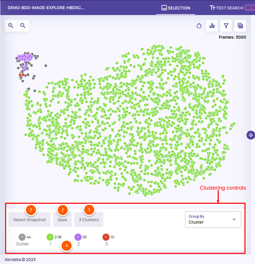
Changing the number of clusters: The number of clusters in the default presented visualization can be changed to better capture the categories/clusters that are present in the feature space.
Saving cluster state: The current state of clustering can be saved as a snapshot with a name.
Select snapshot: A clustering state snapshot that was saved can be loaded back.
Cluster legends: Each cluster area shows the colour of the point for that cluster, the number of images in that cluster and a cluster name. By default, the cluster number(1, 2, 3) is used as a cluster name with one special cluster named 'Outlier'. The 'Outlier' cluster represents points that do not belong to any cluster. On clicking the cluster legend, the following controls are available

Rename a cluster: You can provide any name to the cluster that can be used as an identifier for the contents of the cluster.
Split cluster: Split a cluster into multiple parts for finer-grained exploration of the cluster.
Merge cluster: Merge the cluster into a parent cluster in the hierarchy.
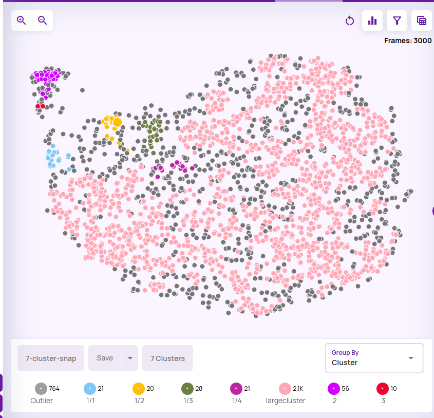
The below screenshot shows the 'green' cluster from the screenshot above being split into 5 smaller clusters and one of the clusters being named as 'largecluster'.
Manual Sampling
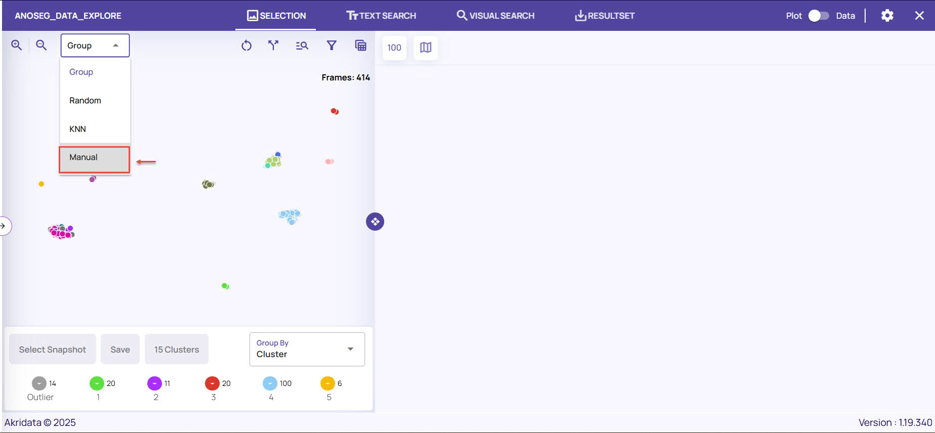
You can also do a manual sampling to view the frames specific to the manually selected region on the plot view.
Refer to the following video for the steps to do manual sampling.
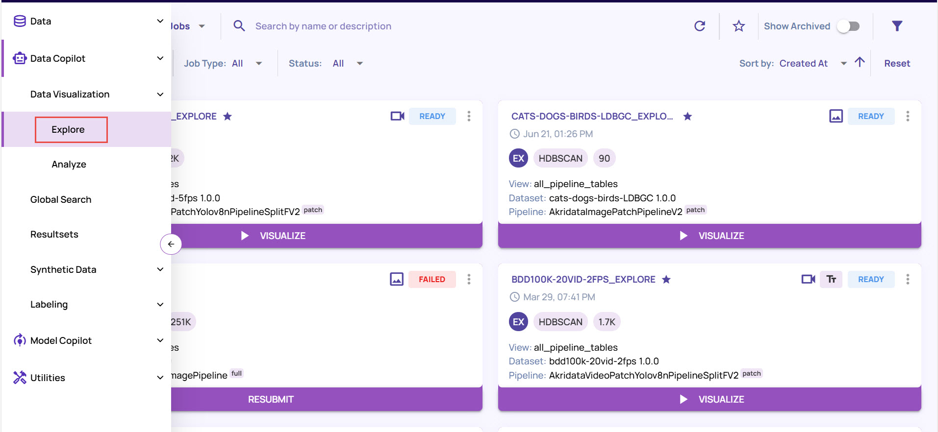
Navigate to Data Visualization > Explore.
Locate the job for which you want to do a manual sampling, and click Visualize.
On the Job page, click the drop-down arrow available on the top left corner, and select Manual.
Click the Pen icon to draw the bounding box.
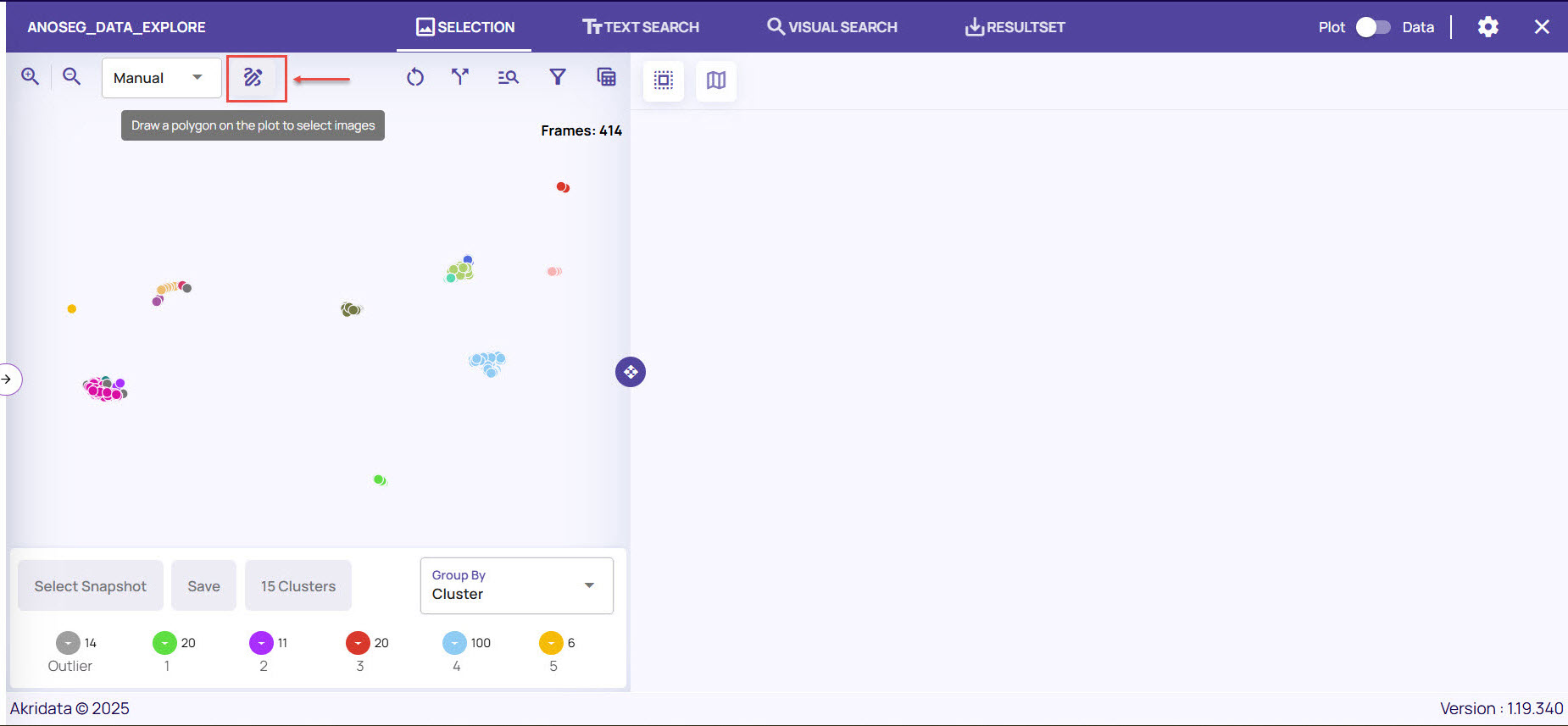
Click a point near to a sample cluster and continue to click at different points until you draw a polygon.
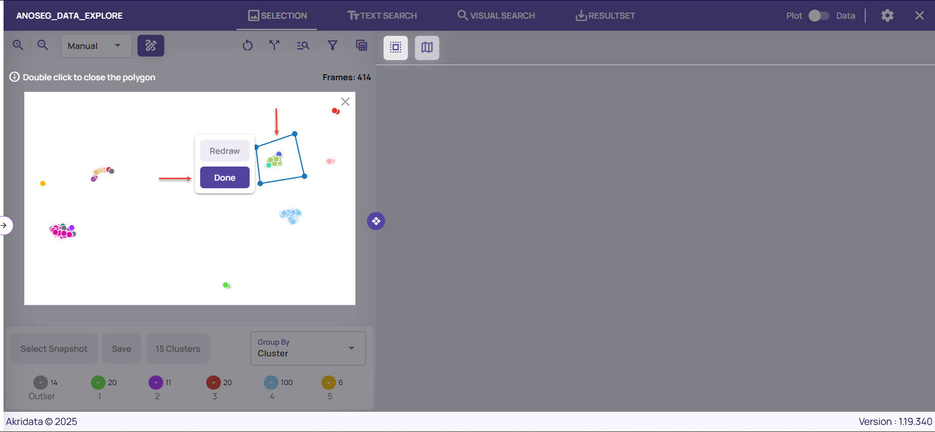
Double-click at the starting point to complete the polygon, and click Done.
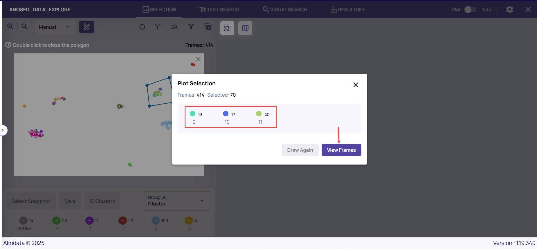
The Plot Selection Frame window appears displaying the number of frames selected out of the total cluster.
If you are satisfied with the selection, click View Frames.
To draw a different polygon, you can click Redraw.
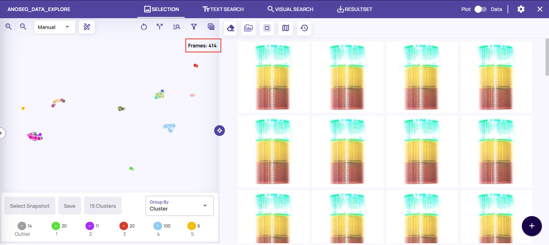
The results pane(right side) displays the images corresponding to the selected frames.